Using the set matrix: Rich analysis of relations across categories
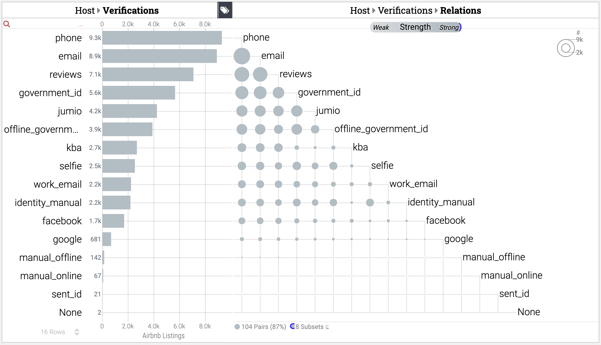
Keshif's set matrix provides deeper visual exploration and presentation of the relationships between different categories of multi-categorical data attributes. Specifically, this chart reveals how different categories appear together in a dataset, and how frequently, and enable trend and outlier analysis across all categorical pair combinations.
- Each circle represents the group of records that includes both intersecting categories.
- The size of the circle shows the size of the measurement of the records. The larger
values correspond to larger measurements (such as larger number of records).
- If using %-of-Group or %-of-Dependent charts, the size is fixed and maximum for all circles in the chart.
- If data comparisons are used, Keshif uses stacked or side-by-side pie charts to show to measurements and distribution of the compared data groups across all pairs of categories.
To show (or hide) set matrix,
- Click the [ tags ] icon on the top-right corner of a multi-valued categorical chart.
Constraints
- The set matrix is shown on the right or left side of the chart depending on the position (panel) of the categorical chart.
- The set matrix is only available if the categorical chart is in the left or right panels of the dashboard.
Video Tutorial
The design and features of this set matrix has been academically published at IEEE TVCG. Below, you can find the video overview of the technique and various strategies. Note that current Keshif version has an updated design, interactions and analytical settings, thus the descriptions in the video may not always match your current Keshif version.

