Using Group-View: Stacked and Side-by-Side Charts
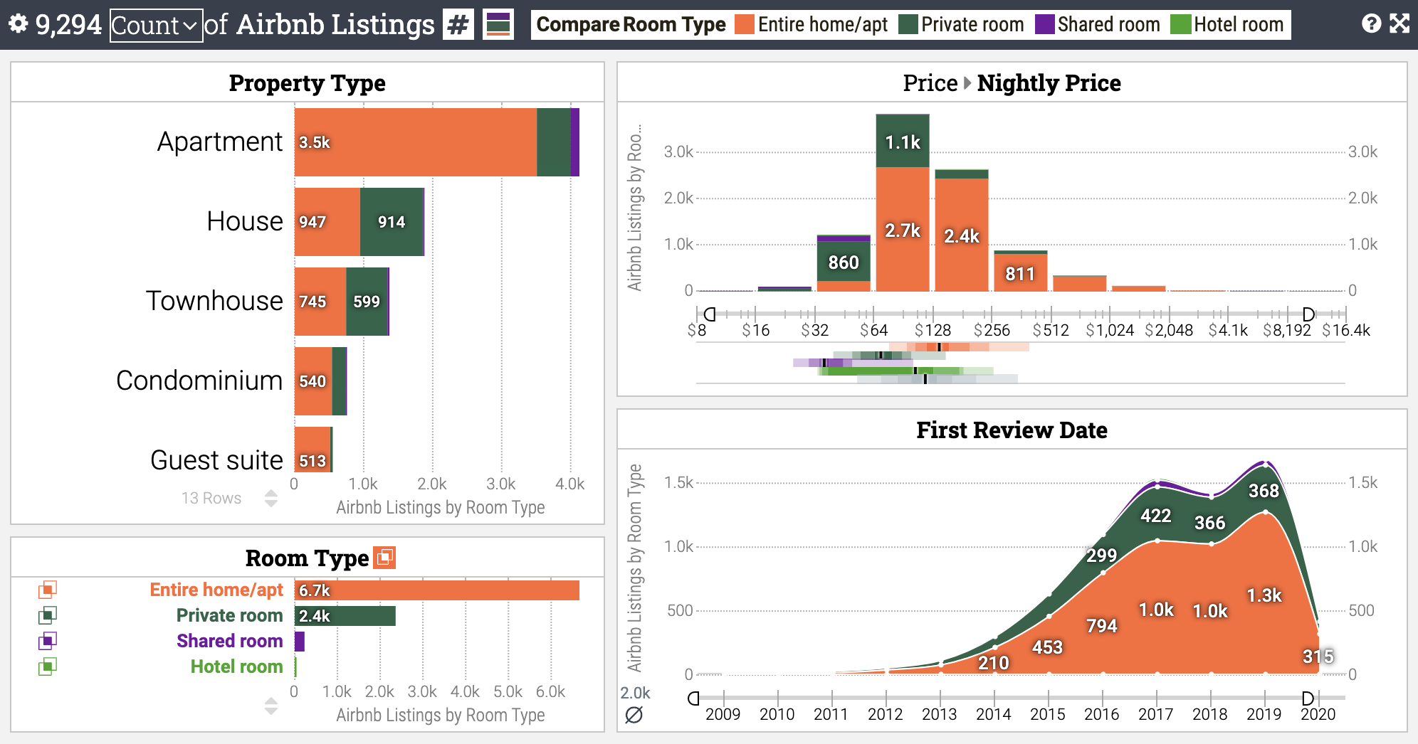
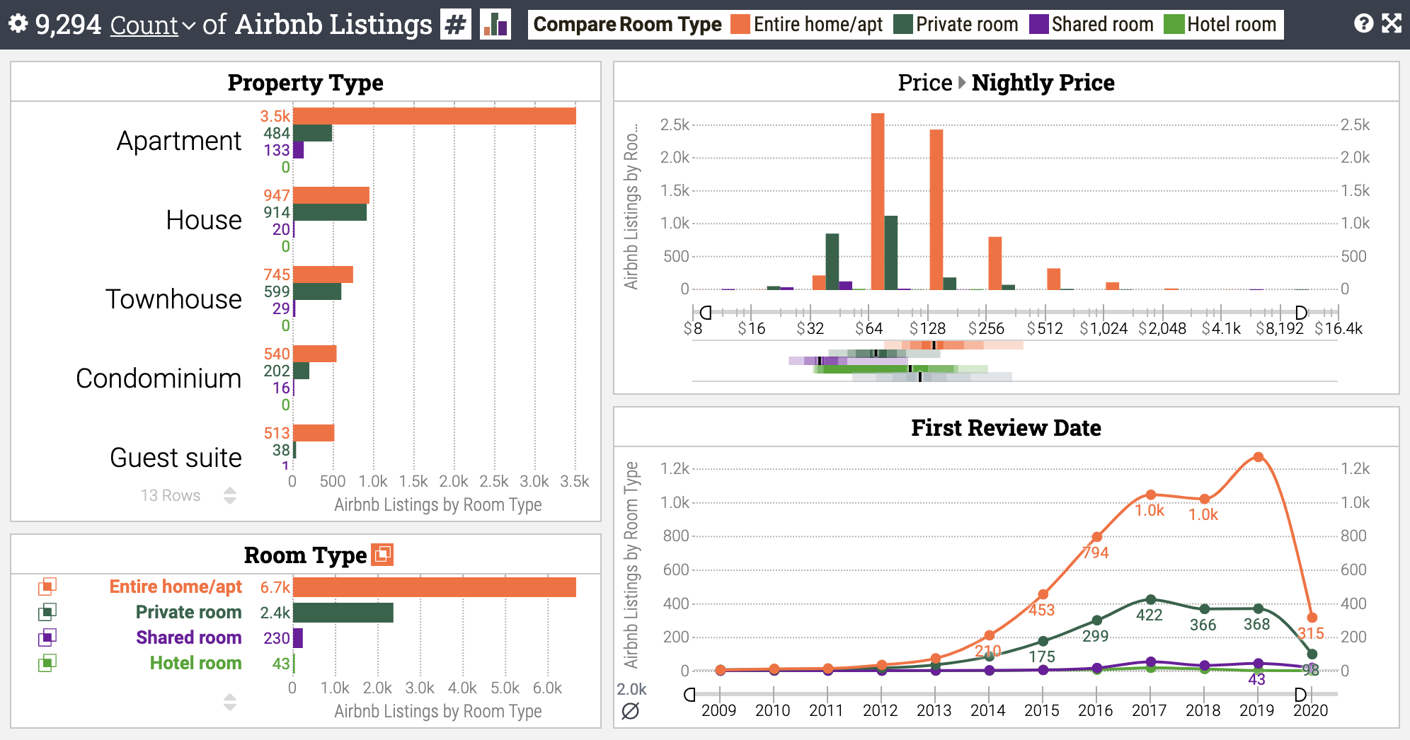
Keshif features a unique approach for creating stacked or side-by-side visualizations across categorical bar charts, histograms, and line-charts.
Stacked Charts
- Stacked charts shows measurements from each compared group stacked on each other.
- The groups do not overlap.
- Stacked charts are ideal to observe overall trends, and combined group totals, but less
ideal to make comparisons across groups.

Side-by-side Charts
- Side-by-by charts shows measurements from each compared group on the same baseline.
- This can improve making one-to-one comparison between data groups.

Selecting stacked or side-by-side group-view mode
To change the group-view mode among Stacked Charts and Side-by-Side Charts for aggregate data analysis:
- Click on the group-view icon in data status panel to switch to the alternative mode.
Or,
- Open the dashboard configuration panel, and
- Select the desired Group-View option: Stacked, or Side-by-Side.
Constraints
- Stacked charts are not available if
- Using %-of-Compared breakdown.
- Using %-of-Group or %-of-Total breakdown with multi-categorical data comparison.
- Using average measure function.
- Using sum measure functions with a numeric attribute with negative values.
- Side-by-side charts are not available if
- Using %-of-group breakdown with single-categorical data comparison.
