◆ Visual analysis of time-series data
What is Time-Series Data?
Datasets sometimes include measurements of a numeric attribute at different time points, such as year or
day. Examples include annual measurements of wealth or development of a country (commonly called
“indicators” or “indexes”), daily measurements of stock prices, hourly temperature readings in a city, or
even your personal weight or blood pressure over time.These measurements (called time-series attributes in
Keshif) can be analyzed over time.

Above, you see a time-series data describing life-expectancy in some country. A dataset can include
multiple countries, and multiple time-series data (indicators).
Keshif creates carefully designed charts and interactions for understanding and exploring time-series
data. Different charts display the full story of all data records of a specific time-series attribute.
This includes the geographic distribution and trends using maps, rankings and values listed on a specific
time, or scatter plots that let you analyze correlations and dynamic interactions over time.
Using record time-series charts
Time-series charts show the data over time for all records in dataset at once, and offer many additional features to change analysis focus.
Analyzing data over time in a record list
Record list charts with sorting by time-series data provide additional charts and interaction methods for richer analysis.
[VIDEO]
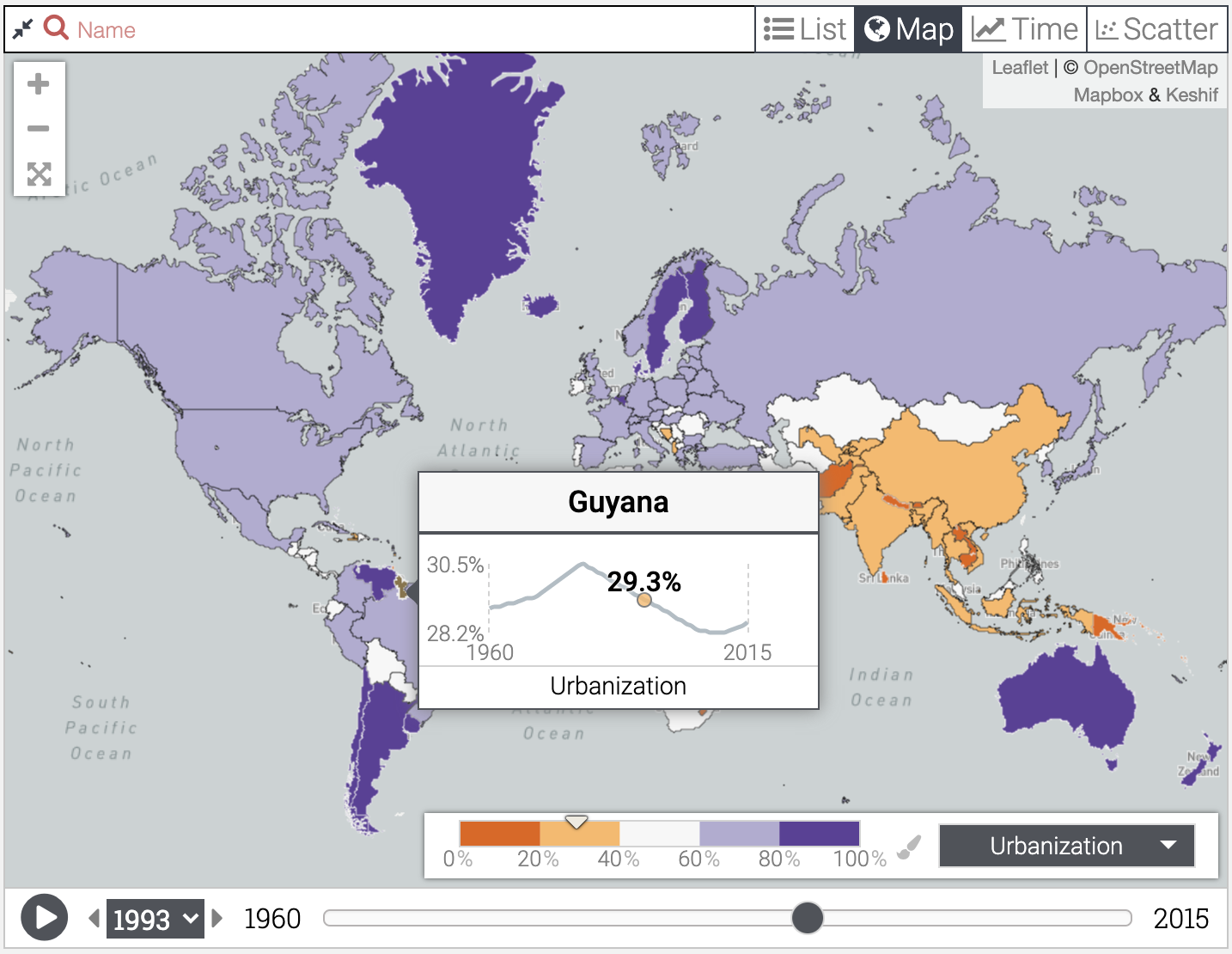
Analyzing data over time in a record map
Record maps with coloring by time-series data provide additional charts and interaction methods for richer analysis.
Analyzing data over time in a scatter plot
Using time-series data for position, size, or coloring in record scatter plots yields a richer analysis.
Creating sparkline charts
Sparklines are compact visualizations that show the trends over time on a single record.

