
Using percentile charts for analyzing numeric data distributions
Keshif features a unique percentile chart type as a rich exploratory refinement of box-and-whisker plots.
- Percentile charts can effectively visualize numeric data trends across multiple data groups using a compact design.
- A percentile chart reveals the median (50th percentile) and other percentile characteristics of a numeric data attribute. The median is the true midpoint of a dataset – half of the records will have a larger value than the median, and half of the records will have a smaller value.
- Each percentile range, colored from dark to light across the median line, includes roughly 10% (1-in-10) of the data. Specifically, each colored box reveals a range such as 20 to 30 percentile, or 80 to 90 percentile. The visualization quickly reveals the skewness of the data, that is, whether large or small values are more common.
- Unlike histograms, this chart type is not suitable to show measurements, such as count and other metrics, across regular bins.
Viewing or hiding percentile chart
- Learn how to view or hide the percentile chart.
Using a percentile chart for group comparison
To compare trends across groups, simply select the data groups for comparison. Learn more.
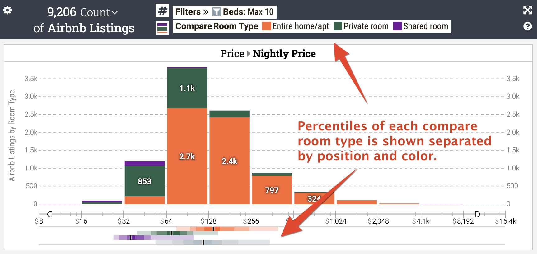
In the sample chart below, percentile charts show that apartments have higher median prices than private rooms, which have higher prices than shared rooms. The bottom row shows the distribution of the entire dataset across the different compared groups.
In contrast, the histogram in the center of the chart describes the number of each group in the binned categories. While informative, it's difficult to look at the histogram and definitively say which group has the most expensive median price, and by how much it's different compared to other groups of data.
Special Features
-
The percentile plot is not linked to analytics settings, such as measurement mode or breakdown mode. For example, if average rating is the selected measurement for bins in the histogram, the distribution of the percentiles stays based on the simple distribution (e.g., count) of the numeric attribute.
-
The percentiles share the same value axis with the histogram above it, including binning scale type.