◆ Introduction to visual analytics with Keshif
Our knowledge base includes over 120 topics, covering core features, important settings, and keys to more detailed analysis.
To get you started with navigating this material, we offer a curated list of main topics that will help you gain a deep understanding of visual analytics using Keshif's technology and design.
Dashboarding
Overview of dashboard layout

Data Selections
Record Group Selections Overview
Filtering data for visual analysis
Analytical Settings
Using breakdown modes on group comparisons

Measuring aggregated data for analysis
Core Charts
Using categorical charts: Bars & Choropleth Maps
Using interval charts: Histograms, Line-charts
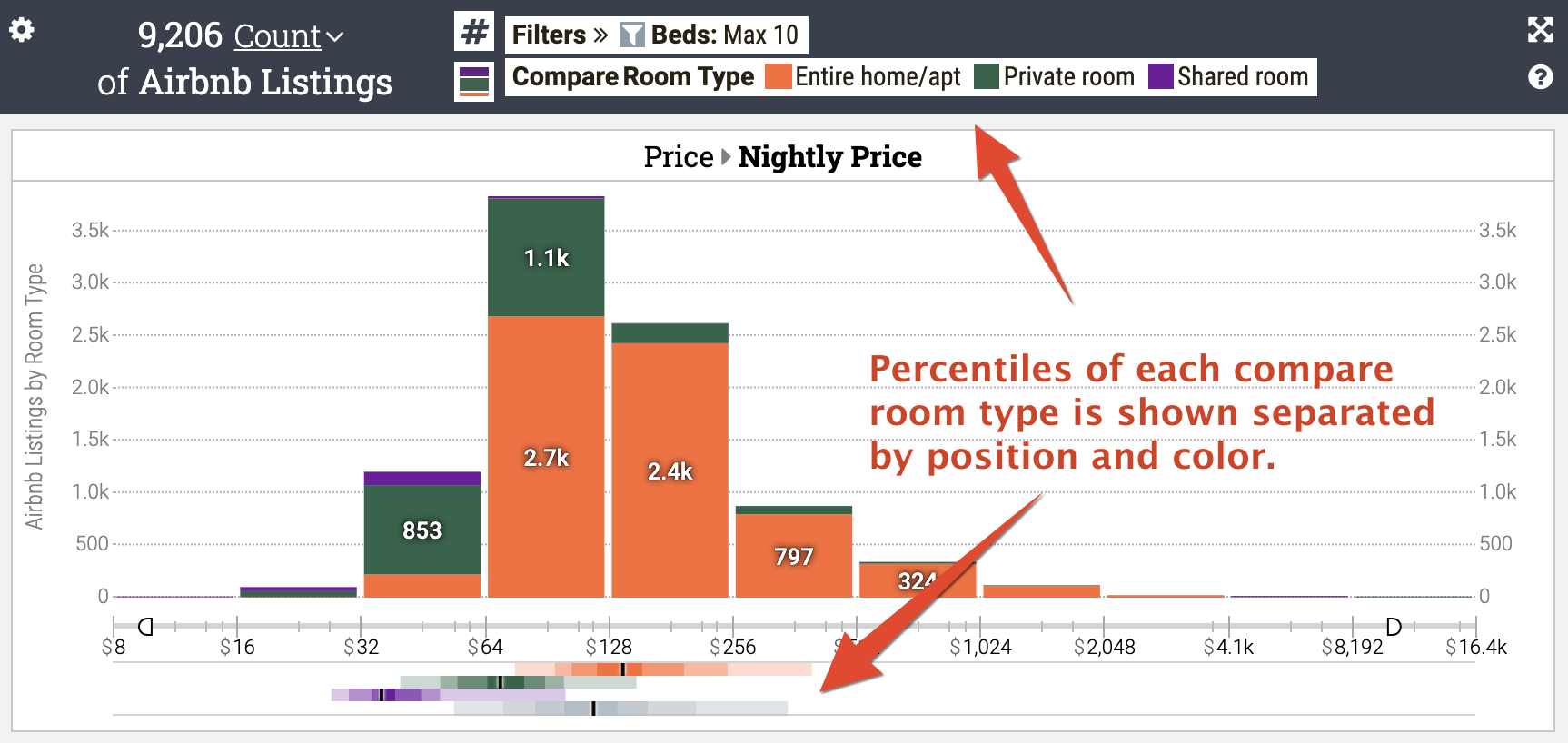
Group-View: Stacked and Side-by-Side Charts
Using record lists
Using record maps: Choropleth, point and cluster maps
Using record scatter plots
Using record time-series charts
More on Charting
Creating a bump chart
Creating a time-indexed chart
Creating a slope chart
Using sparkline charts

Using percentile charts for numeric data